Compose Multiplatform自定义可下拉输入框组件
2023-03-08
compose自带库中的TextField和outlinedTextField有默认的大小,都属于Material风格的输入框,最小尺寸很大,如果要创建UI上比较紧凑的表单,就需要自定义组件了,同时让这个自定义组件也可作为下拉框来使用
1. 阅读BaseTextField
自带库中,有一个BaseTextField组件,它位于package androidx.compose.foundation.text,我们可以先看下它的注释:
Basic composable that enables users to edit text via hardware or software keyboard, but provides no decorations like hint or placeholder. Whenever the user edits the text, onValueChange is called with the most up to date state represented by String with which developer is expected to update their state. Unlike TextFieldValue overload, this composable does not let the developer to control selection, cursor and text composition information. Please check TextFieldValue and corresponding BasicTextField overload for more information. It is crucial that the value provided in the onValueChange is fed back into BasicTextField in order to have the final state of the text being displayed.
从上述注释中可以确定两件事:
- BaseTextField是一个基础的文本输入框,它不提供任何装饰,比如hint和placeholder
- 当用户编辑文本时,会调用onValueChange,并传入最新的String类型的值,这一点和TextField和outlinedTextField是一致的
看下BaseTextField的函数定义:
@Composable
fun BasicTextField(
    value: String,
    onValueChange: (String) -> Unit,
    modifier: Modifier = Modifier,
    enabled: Boolean = true,
    readOnly: Boolean = false,
    textStyle: TextStyle = TextStyle.Default,
    keyboardOptions: KeyboardOptions = KeyboardOptions.Default,
    keyboardActions: KeyboardActions = KeyboardActions.Default,
    singleLine: Boolean = false,
    maxLines: Int = Int.MAX_VALUE,
    visualTransformation: VisualTransformation = VisualTransformation.None,
    onTextLayout: (TextLayoutResult) -> Unit = {},
    interactionSource: MutableInteractionSource = remember { MutableInteractionSource() },
    cursorBrush: Brush = SolidColor(Color.Black),
    decorationBox: @Composable (innerTextField: @Composable () -> Unit) -> Unit =
        @Composable { innerTextField -> innerTextField() },
) {
    //省略函数体
}
可以发现大部分的参数和TextField和outlinedTextField是一致的本处不再介绍,这里关注decorationBox参数,同样先看参数注释:
decorationBox - Composable lambda that allows to add decorations around text field, such as icon, placeholder, helper messages or similar, and automatically increase the hit target area of the text field. To allow you to control the placement of the inner text field relative to your decorations, the text field implementation will pass in a framework-controlled composable parameter “innerTextField” to the decorationBox lambda you provide. You must call innerTextField exactly once.
简单来说这个参数的作用是:
允许在文本字段周围添加装饰,例如图标,占位符,帮助程序消息或类似内容,并自动增加文本字段的命中目标区域
要把自定义组件可作为下拉框来使用,这个参数将会传入Icon
至于小尺寸的问题,只要使用这个函数时textStyle传入字体小一些的对象即可,因为它不同于Material风格的组件有最小高度
2. 使用BaseTextField
根据上述思路,给出一个简单的修改:
import androidx.compose.foundation.border
import androidx.compose.foundation.layout.*
import androidx.compose.foundation.text.BasicTextField
import androidx.compose.material.LocalTextStyle
import androidx.compose.material.MaterialTheme
import androidx.compose.material.Text
import androidx.compose.runtime.Composable
import androidx.compose.ui.Alignment
import androidx.compose.ui.Modifier
import androidx.compose.ui.graphics.Color
import androidx.compose.ui.graphics.SolidColor
import androidx.compose.ui.unit.TextUnit
import androidx.compose.ui.unit.dp


@Composable
fun CustomTextField(
    modifier: Modifier = Modifier,
    leadingIcon: (@Composable () -> Unit)? = null,
    trailingIcon: (@Composable () -> Unit)? = null,
    placeholderText: String = "",
    fontSize: TextUnit = MaterialTheme.typography.body2.fontSize,
    readOnly: Boolean = false,
    value: String,
    onValueChange: (String) -> Unit,
) {
    val contentTextColor = MaterialTheme.colors.onSurface
    BasicTextField(modifier = modifier
        .fillMaxWidth(),
        value = value,
        onValueChange = onValueChange,
        readOnly = readOnly,
        singleLine = true,
        cursorBrush = SolidColor(MaterialTheme.colors.primary),
        textStyle = LocalTextStyle.current.copy(
            color = contentTextColor,
            fontSize = fontSize
        ),
        decorationBox = { innerTextField ->
            Row(
                modifier,
                verticalAlignment = Alignment.CenterVertically
            ) {
                if (leadingIcon != null) leadingIcon()
                Box(Modifier.weight(1f)) {
                    if (value.isEmpty()) Text(
                        placeholderText,
                        style = LocalTextStyle.current.copy(
                            color = MaterialTheme.colors.onSurface.copy(alpha = 0.3f),
                            fontSize = fontSize
                        )
                    )
                    innerTextField()
                }
                if (trailingIcon != null) trailingIcon()
            }
        }
    )
}
接下来只需要把这个函数放入一个带边框的Box布局中,就可以实现一个可视友好的输入框(可作为下拉框)
更进一步,此处给出水平布局和纵向布局的两种实现:
- 水平实现:
@Composable
fun HorizontalCustomTextField(
    modifier: Modifier = Modifier,
    textContent: (@Composable () -> Unit),
    otherContent: (@Composable () -> Unit)? = null,
    customTextFieldContent: (@Composable () -> Unit),
) {
    Row(
        modifier = modifier,
        verticalAlignment = Alignment.CenterVertically,
        horizontalArrangement = Arrangement.Start
    ) {
        Column(modifier = Modifier.weight(0.4f)) {
            textContent()
        }
        Spacer(modifier = Modifier.width(5.dp))
        Box(Modifier.weight(0.99f).border(1.dp, Color.LightGray, RoundedCornerShape(percent = 20))) {
            customTextFieldContent()
            otherContent?.let {
                it()
            }
        }
    }
}
- 垂直实现:
@Composable
fun VerticalCustomTextField(
    modifier: Modifier = Modifier,
    textContent: (@Composable () -> Unit),
    customTextFieldContent: (@Composable () -> Unit),
) {
    Column(
        modifier = modifier,
        horizontalAlignment = Alignment.CenterHorizontally,
        verticalArrangement = Arrangement.Center
    ) {
        textContent()
        Box(Modifier.weight(0.99f)) {
            customTextFieldContent()
        }
    }

}
垂直实现可以仿照水平实现也加上otherContent参数,因为我写出垂直的后并没有使用过,因此不如水平的完整
3.自定义组件的使用:
- 非下拉框:
//省略上方代码,item是LazyListScope
item {
    val ipAndPort: MutableState<String?> = mutableStateOf(null)
    HorizontalCustomTextField(
        textContent = { Text("IP和端口") },
        modifier = Modifier.fillMaxWidth(),
    ) {
        CustomTextField(
            modifier = defaultModifier,
            fontSize = textUnit(),
            value = ipAndPort.value ?: "",
            onValueChange = {
                ipAndPort.value = it
            },
            placeholderText = "服务器IP与端口",
            readOnly = false,
        )
    }
}
- 下拉框:
item {
    val dropFlag = mutableStateOf(false)
    val communicationMode: MutableState<CommunicationMode?> = mutableStateOf(null)
    HorizontalCustomTextField(
        textContent = { Text("通信方式") },
        modifier = Modifier.fillMaxWidth(),
        otherContent = {
            DropdownMenu(
                expanded = dropFlag.value,
                onDismissRequest = { dropFlag.value = false },
                modifier = Modifier.fillMaxWidth(0.1f)
            ) {
                CommunicationMode.values().forEach {
                    DropdownMenuItem(onClick = {
                        communicationMode.value = it
                        dropFlag.value = false
                    }) {
                        Text(text = it.description, fontSize = textUnit())
                    }
                }
            }
        }
    ) {
        CustomTextField(
            modifier = defaultModifier,
            fontSize = textUnit(),
            value = communicationMode.value?.description ?: "",
            onValueChange = {
                            },
            placeholderText = "通信协议",
            readOnly = true,
            trailingIcon = {
                Icon(
                    Icons.Rounded.ArrowDropDown, contentDescription = "Drop down select",
                    modifier = Modifier.clickable(enabled = true, onClick = {
                        dropFlag.value = true
                    })
                )
                           },
            )

    }


}

//配合阅读,同时给出`CommunicationMode`枚举的代码:

enum class CommunicationMode(
    val index: Int,
    val description: String
) {
    TCP(0, "TCP"),
    UDP(1, "UDP"),
    MQTT(2, "MQTT"),
}
4.效果图:
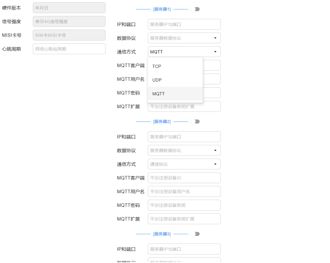
图中所有输入框均使用的是上文中的自定义组件